
Specializing in Rock ‘n’ Roll – Rockabilly – Doowop – Rhythm ‘n’ Blues and related styles from original 1950’s artists to the bands on today’s Rockin’ scene
Design & artwork for print in Norfolk
Specializing in Rock ‘n’ Roll – Rockabilly – Doowop – Rhythm ‘n’ Blues and related styles from original 1950’s artists to the bands on today’s Rockin’ scene
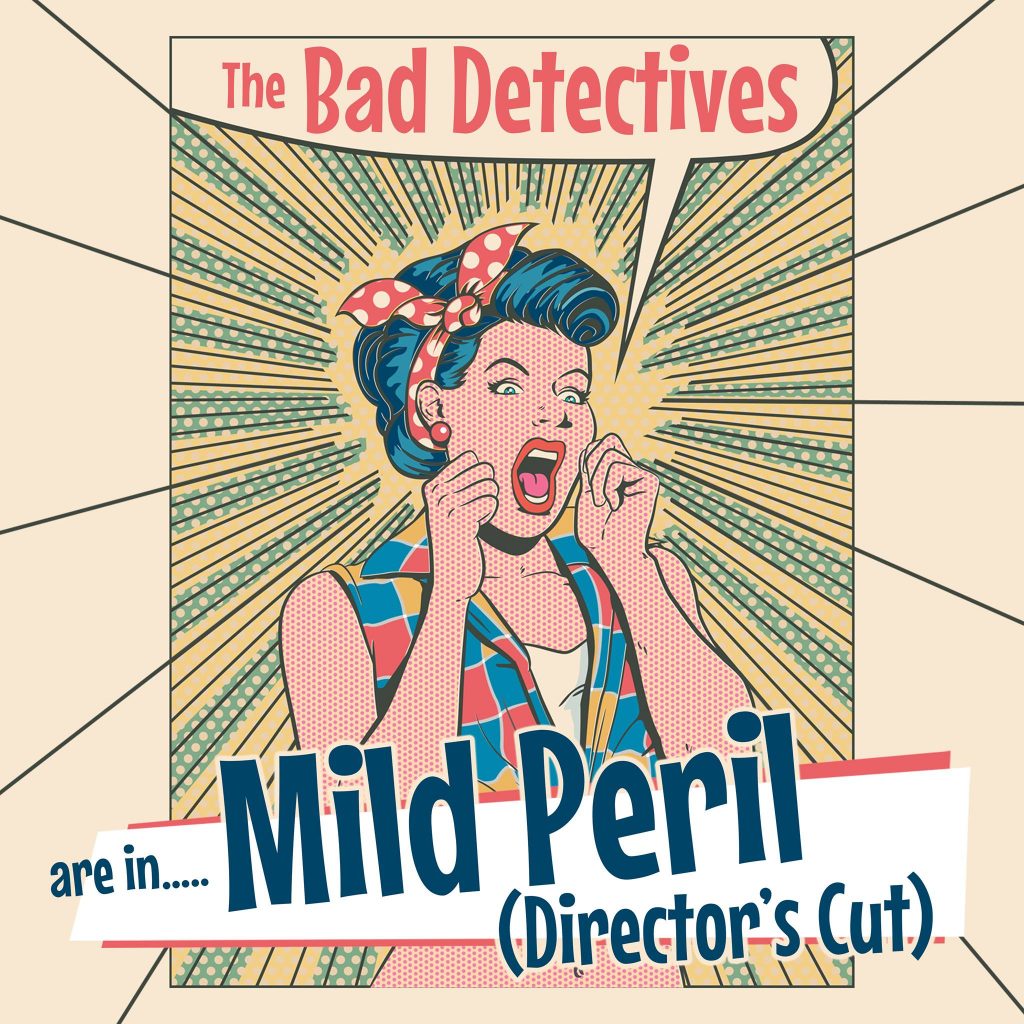
Back in 2016 I produced the artwork for a fine 10″ coloured vinyl rock ‘n’ roll release from West Country nutters; The Bad Detectives. With classy titles such as “There’s A Love Guru In The Village Barn” and “Shepton Prison Blues” I think you know it’s not going to be the usual affair! This 8 track EP has now been expanded with 6 more tracks to make a 14 track album and recpackaged for release on CD. Artwork now approved and on it’s way to the pressing plant.

Yet more rock ‘n’ roll goodness on it’s way. I have just had the artwork for this new album from The Pat Winn Combo signed off for the pressing plant on the Western Star label in Somerset. Interestingly though Pat is based in Norfolk and tells me he once worked at “The Duke” in Bacton when our band used to play there regularly! A bit of cartoon work on this one.

Another CD packaging job sorted, this time for my mates in Norwich; The V8 Rockets. A hard working and well respected bunch of local musicians playing traditional rockabilly at rock ‘n’ roll clubs across the country for many years.
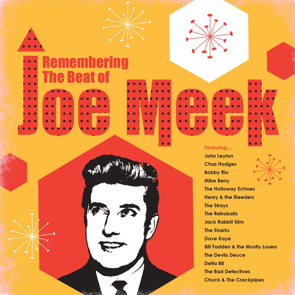
This will be the third Joe Meek themed compilation album I have produced
artwork for on the Western Star label. Includes new recordings by a mix
of original stars who recorded with the genius that was Joe Meek, along
with modern bands on the rock ‘n’ roll scene today covering songs which
Joe Meek added his magic to back in the day. Western Star recording
studio, just outside Bath in the UK, has a long history of affiliation
with Joe Meek artists and sound equipment. Another great
project to be involved in if you’re a rock ‘n’ roll freak like me. The
design remit was to make the packaging look like a design from the early
sixties in the UK. Hopefully the shapes and colours do just that. I
love the fact that in the sixties most of the print was produced using
spot colours of solid ink rather than the CMYK process used nowadays so
designs were limited to 2 or 3 (sometimes 4) solid colours. The inks
were nowhere near as bright in those days so rock ‘n’ roll albums would
try and be as vivid and wild as possible but by today’s standard
definitely have a look of their time.
The dots within the name “Joe
Meek” are there to represent the sound suppressing tiles found on the
walls of many recording studios