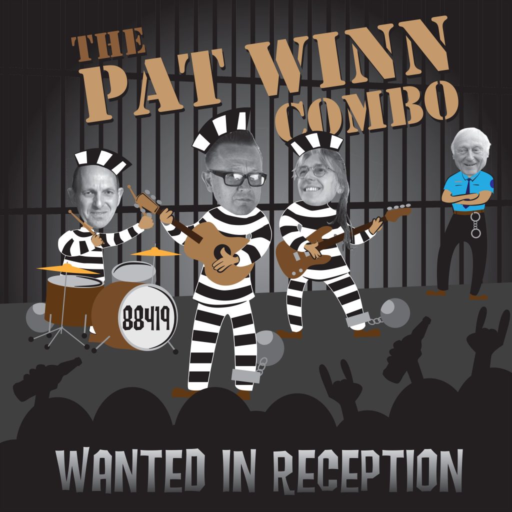
Yet more rock ‘n’ roll goodness on it’s way. I have just had the artwork for this new album from The Pat Winn Combo signed off for the pressing plant on the Western Star label in Somerset. Interestingly though Pat is based in Norfolk and tells me he once worked at “The Duke” in Bacton when our band used to play there regularly! A bit of cartoon work on this one.
V8 Rockets New CD artwork!
Another CD packaging job sorted, this time for my mates in Norwich; The V8 Rockets. A hard working and well respected bunch of local musicians playing traditional rockabilly at rock ‘n’ roll clubs across the country for many years.
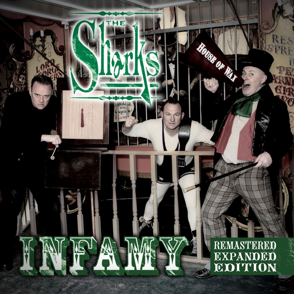
New artwork for The Sharks Infamy CD (expanded)
Just signed this beauty off ready for the pressing plant. A re-issue of the “Infamy” album by “The Sharks”. This great album has just been made even better by the addition of extra tracks and remixes. Anybody who knows anything about psychobilly knows this band were there at the birth of psychobilly (if not before) and, I think it’s fair to say, cast the die for what is considered the British psychobilly style both in terms of sound and fashion. Songs like “Take a razor to your head” on Nervous Records epitomised everything generally associated with the genre probably more so than the bass guitar, punky sound of bands like The Meteors, The Cramps and King Kurt who are often cited as the origins of the style from around the same time.
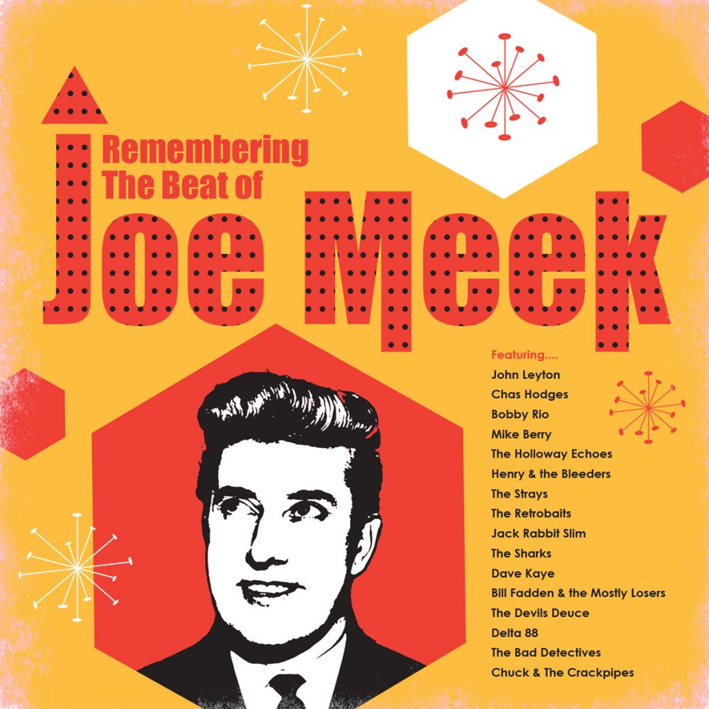
Remembering Joe Meek CD cover
This will be the third Joe Meek themed compilation album I have produced
artwork for on the Western Star label. Includes new recordings by a mix
of original stars who recorded with the genius that was Joe Meek, along
with modern bands on the rock ‘n’ roll scene today covering songs which
Joe Meek added his magic to back in the day. Western Star recording
studio, just outside Bath in the UK, has a long history of affiliation
with Joe Meek artists and sound equipment. Another great
project to be involved in if you’re a rock ‘n’ roll freak like me. The
design remit was to make the packaging look like a design from the early
sixties in the UK. Hopefully the shapes and colours do just that. I
love the fact that in the sixties most of the print was produced using
spot colours of solid ink rather than the CMYK process used nowadays so
designs were limited to 2 or 3 (sometimes 4) solid colours. The inks
were nowhere near as bright in those days so rock ‘n’ roll albums would
try and be as vivid and wild as possible but by today’s standard
definitely have a look of their time.
The dots within the name “Joe
Meek” are there to represent the sound suppressing tiles found on the
walls of many recording studios
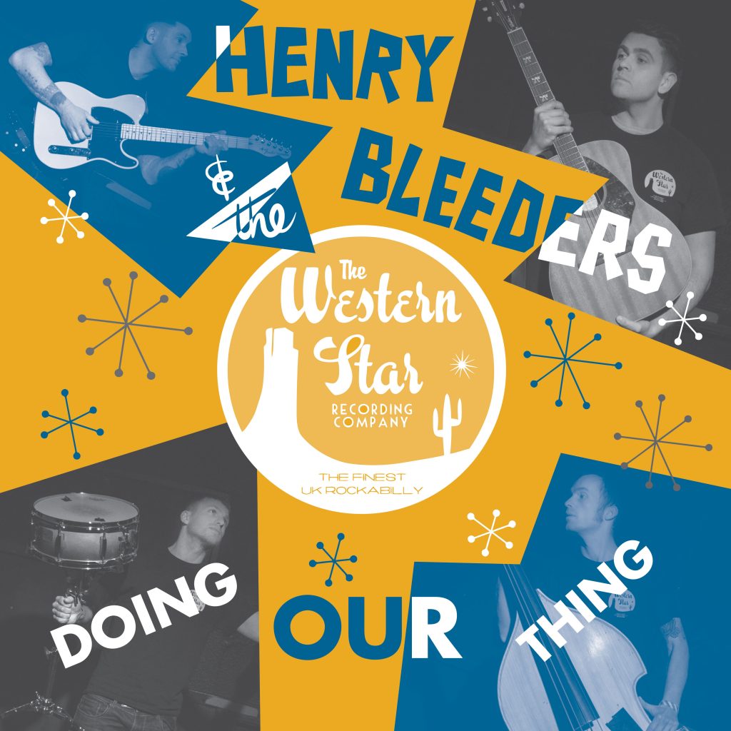
Henry and The Bleeders new CD
Another Western Star release approved. This time it’s the new CD album from Henry & The Bleeders. I’ve worked on many covers for this great rockabilly band, it seems they’ve been around forever. Some of the songs here are on the recent, limited edition vinyl 10 inch ( “The Beast” ) but this is the full album. Henry & The Bleeders are about to perform their 15th anniversary gig on 30th November in Bedford.
- « Previous Page
- 1
- …
- 22
- 23
- 24
- 25
- 26
- …
- 44
- Next Page »